As every Monitoring, Evaluation, and Learning (MEL) specialist knows, technical reports are the main means by which a team conveys their findings to program stakeholders. Tremendous amounts of primary and secondary data collection, analysis, and drafting go into these documents. We become invested in them, thinking every scrap of data is important to include. Yet many of our stakeholders are juggling massive portfolios and simply don’t have the time to dive into a long, technical report to get to the conclusions and recommendations they need to do their jobs. In our work with our U.S. Department of State clients, Dexis incorporates various data visualization tools to help condense reports, make information more accessible, and bring topline conclusions and recommendations to the fore.
Long-term evaluation of programs across multiple nations can include ingesting and cataloguing weekly updates from implementers, taking fastidious notes during regular check-in calls, tracking a range of quantitative data—from dollars spent to widgets delivered—and conducting literature reviews. Field work and key informant interviews also generate detailed notes.
Given this copious material, one of the first project evaluations I helped produce was over 40 pages. My team and I outlined the methodology, described the analytical process in detail, and thoughtfully explained the illustrated data and conclusions. The format followed something of an academic article. Our team was proud of the product. The catch? It remained virtually unread.
Forty pages of technical writing was too much for busy clients whose time is valuable and who need to know conclusions and recommendations but not necessarily how you got there. Since then, I’ve learned to trim project evaluation reports to five pages maximum. The methodological and analytical rigor is still there, but I’ve integrated new techniques for displaying information that have since become standard.
Everyone is familiar with bar charts. They’re a great way to visualize quantitative information grouped into various categories. Yet while bar charts are useful in certain contexts, they generally don’t grab readers’ attention.
Tableau Desktop is a powerful quantitative analysis tool that emphasizes stunning visualizations. While Tableau can make standard bar charts more visually interesting, we’ve found additional ways to get points across.

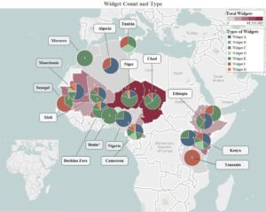
For example, we geocode the majority of our project-related data so that we can show the same data from a bar chart but overlaid onto a map of the African continent. Figure 1 shows fictionalized program data to illustrate the concept. It goes even further by showing two variables: (1) the number of widgets (or dollars) delivered in assistance programming to African partner nations by a particular program; and (2) the relative quantity and type of widgets actually delivered. Geocoding data creates successful visualizations because maps catch the reader’s eye and cut out the need for lengthier exposition.
With such visualizations, you are able to display multiple variables in one graphic and still have the data be clearly understood. Visuals also aid the percentage of the population who are visual learners, and they have added value when dealing with cross-cultural/multi-language teams and stakeholders.
Quantitative information is easy to turn into a graphic, but what about qualitative information? So much of MEL data is qualitative—narratives that go beyond the number of widgets and expound on how individuals use those widgets and what they’ve accomplished. Our team has grappled with representing the rich stories we get from our implementers in the most concise manner possible, allowing decision-makers immediate access to the information they need the most.
For example, formatting is not often thought of as a means of data visualization. Sections of text can be readily turned into data visualizations to neatly organize groupings of information, give the reader a visual break from running text, and move them quickly through the document.
In addition, my project team has hit on a few techniques that are now readily identifiable as our “brand.” Horizontal, green text boxes highlight project successes, which read like a news flash, grabbing the reader with an exciting title and condensing the story into a few sentences, accompanied by a picture. Vertical, blue text boxes list project recommendations. Bulleted sentences offer key phrases or words in bold.
Most important, however, are the results of project indicators. Indicators make the MEL wheels go ‘round. Our team uses a formatted table like Table 1 below to organize indicators in a visually concise way. The description of each indicator begins with a bolded “Yes,” “No,” or some other qualifier like, “Sometimes,” or “Anticipated,” summarizing the following description even further. This approach presents key information in ways that busy readers can take in with a glance.

At Dexis, our MEL teams find value in routinely revisiting the fundamentals of how to display and convey the research we conduct with a clarity that accommodates our clients’ workloads. Shortening technical reports doesn’t mean sacrificing methodological rigor. Just the opposite. Data visualizations pull double duty by condensing text and pushing the team’s analytical skills to the next level. Attention-grabbing visualizations for quantitative and qualitative data can elevate your technical reports and make your research stand out.
Porter Bourie, PhD is Team Lead on the Trans-Saharan Counterterrorism Partnership (TSCTP) program that Dexis supports with MEL efforts, including field assessments, results frameworks, and data collection.


